Mobile Companion Prototype
Yes...I can definitely improve upon this.
Project Venice was an unannounced title in progress at Carbine. As part of an internal game jam, an engineer wanted to collaborate in designing a match 3 game that would tie in with the core gameplay of Venice “somehow”. The initial request was: “can you make this look prettier?”
In order to make the process go more smoothly, I asked for a list of requirements for this game, which were the following:
Designed for iPad pro specs, landscape mode only
Daily loot box screen
Store for upgrade
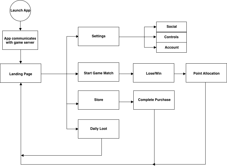
As I only had two weeks to do this, I had to work quickly. In addition to providing UI assets, I decided to make a more useful navigation that would serve the overall vision and make sense of the game's purpose. I began by drafting a quick User Flow to map out the desired functionality.
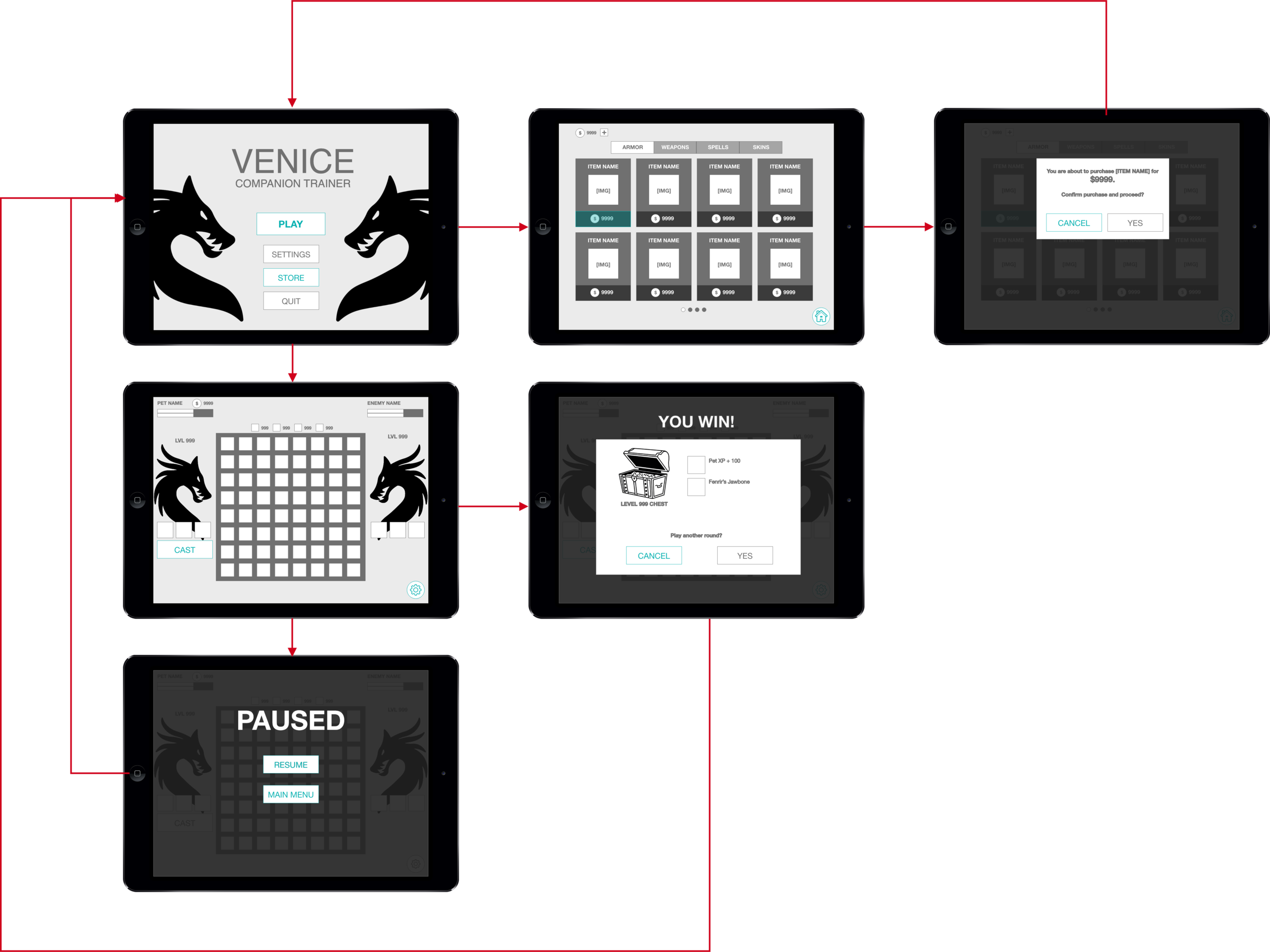
After receiving feedback and adjusting scope to work within time constraints, I created some wireframes to demonstrate what a normal click-through would look like. (Clickable prototype available below.)
Before the project ended, I worked with a "painterly grunge" style for visual fidelity.


